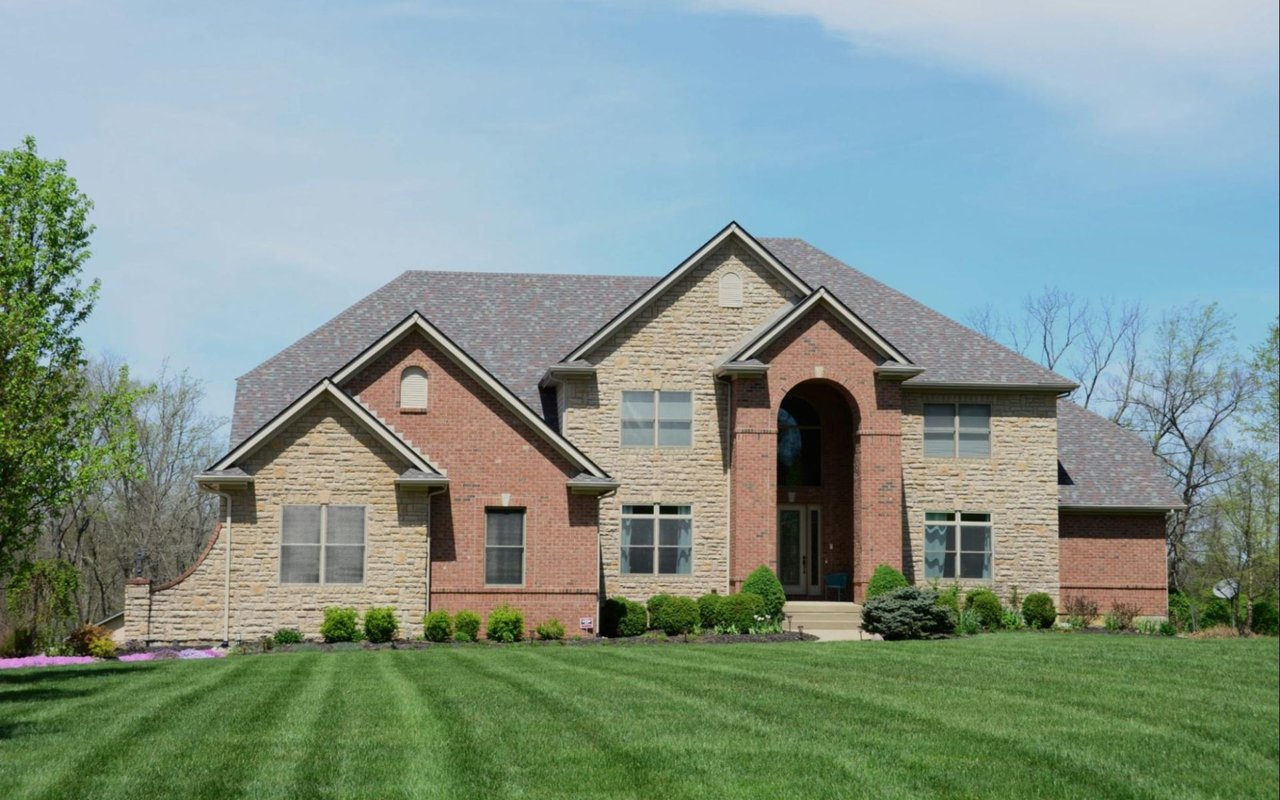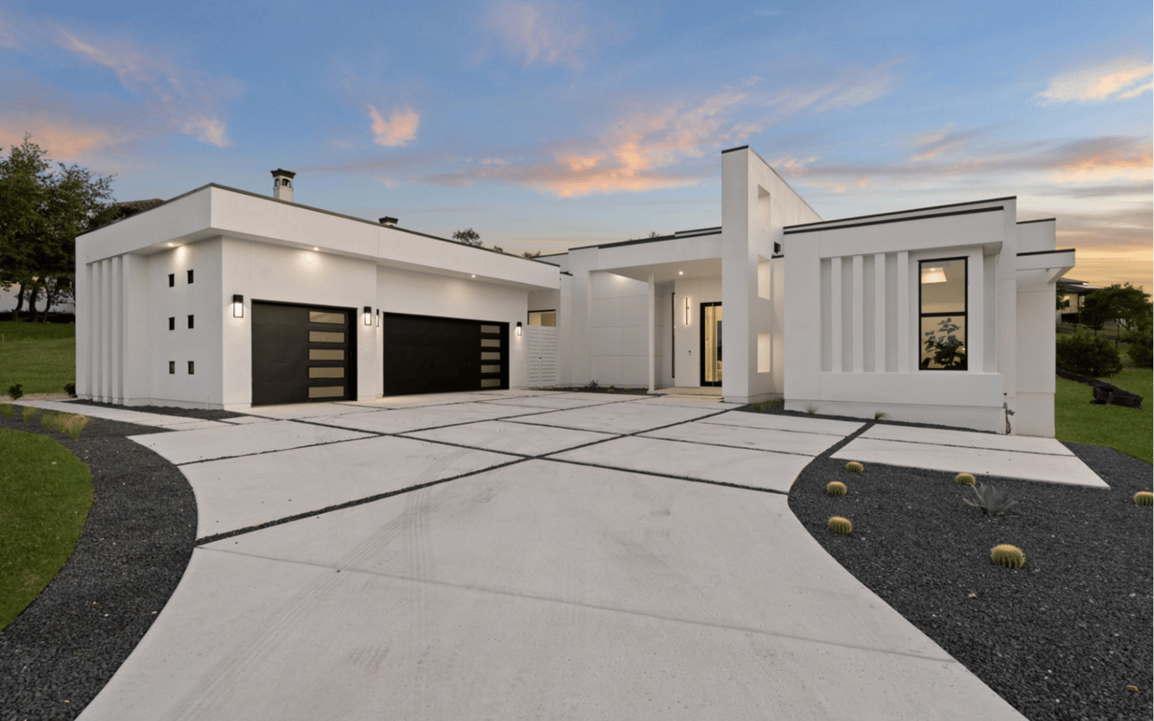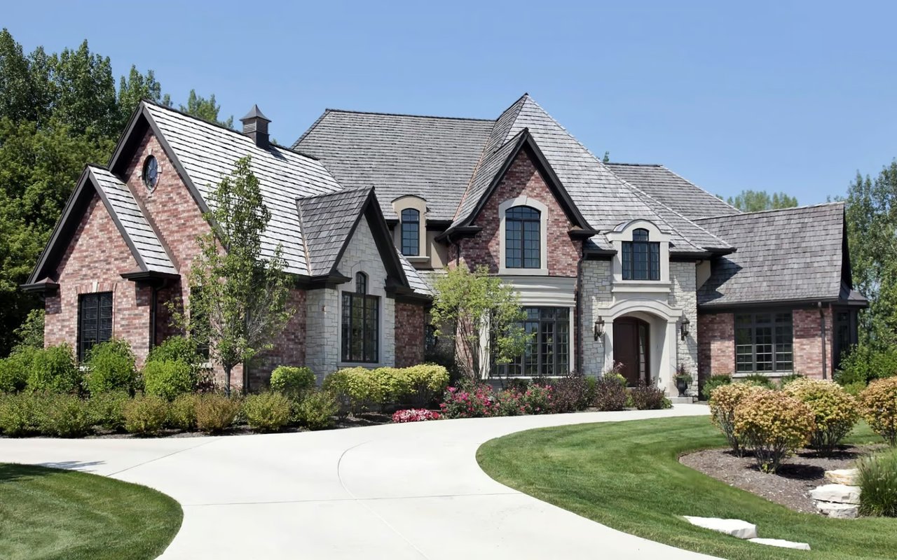
By The Herrera Team
The way a room makes you feel isn't an accident. It's color. The shades you choose for your walls, ceilings, and accents quietly shape your mood, your energy levels, and even how spacious a room feels — all before you've moved a single piece of furniture. If your home doesn't feel quite right, the answer might not be a renovation. It might just be a fresh coat of paint applied with intention.
At The Herrera Team, we work with San Antonio homeowners every day, and we've seen firsthand how thoughtfully applied color psychology in home design can completely transform a space. Here's how to make color work for you.
Key Takeaways:
-
Every color carries a psychological response that directly affects how a room feels to live in
-
The right color for each room depends on how you use that space, not just what looks good on a swatch
-
Lighting, both natural and artificial, plays a major role in how color reads in your home
-
You don't need to repaint every room to make a meaningful impact — strategic choices go a long way
What Is Color Psychology in Home Design?
Color psychology is the study of how different hues influence human emotion and behavior. In interior design, it goes beyond picking colors you like. It's about understanding the psychological response each hue produces and using that knowledge to shape how a space feels to everyone who enters it. A room can be beautifully furnished and still feel off if the color is working against its purpose.
The broad framework is straightforward: warm tones energize, cool tones restore, and neutrals provide the kind of quiet foundation that lets everything else in a room do its job.
The broad framework is straightforward: warm tones energize, cool tones restore, and neutrals provide the kind of quiet foundation that lets everything else in a room do its job.
A Quick Reference for Color Families
-
Warm tones (reds, oranges, yellows): best for social spaces where you want energy, conversation, and connection
-
Cool tones (blues, greens, purples): best for spaces where rest, focus, or mental recovery are the priority
-
Neutrals (whites, creams, taupes, warm grays): create flexibility and balance, adapting to changing light and complement almost any furnishing style
-
Deep, saturated tones (navy, forest green, charcoal): use strategically to add drama and coziness; powerful in small doses, overwhelming at full scale
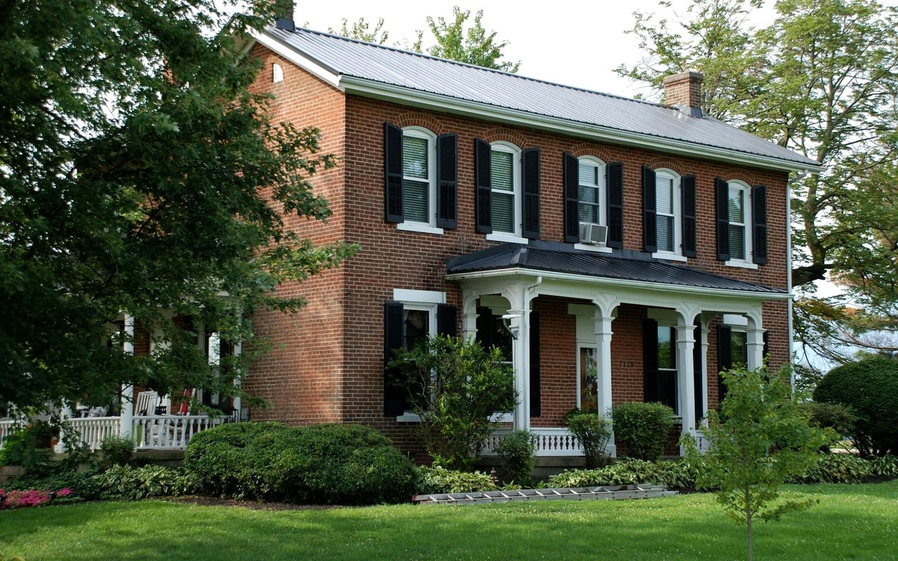
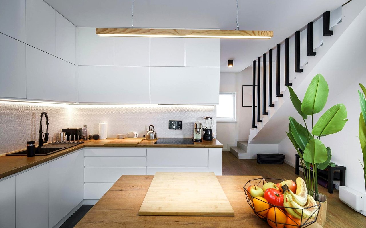
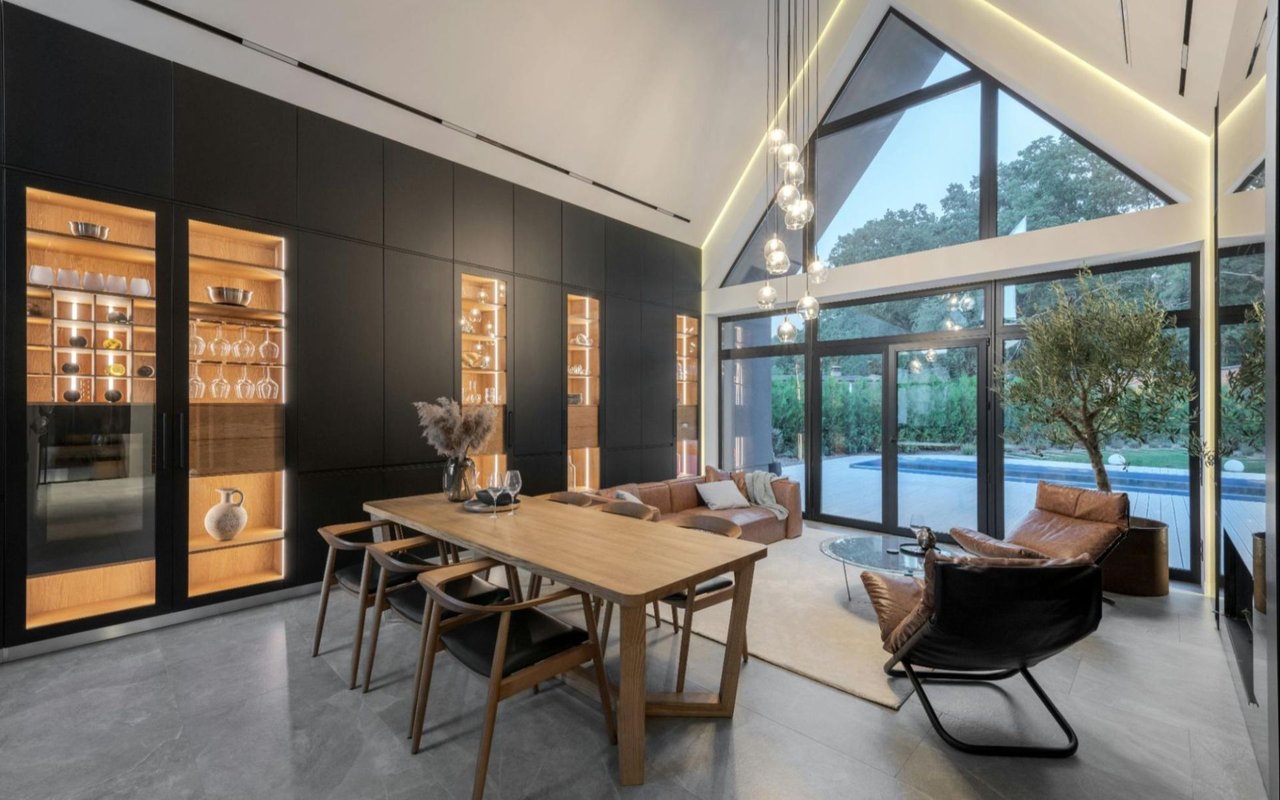
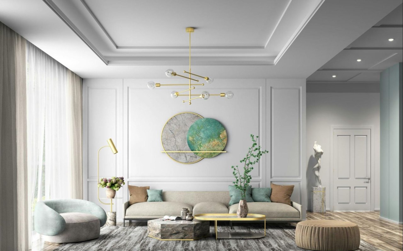
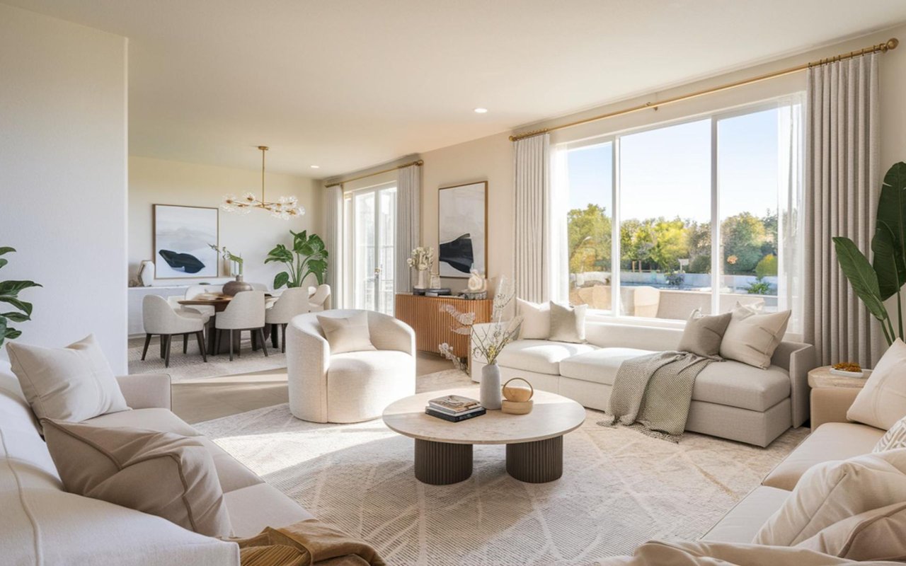
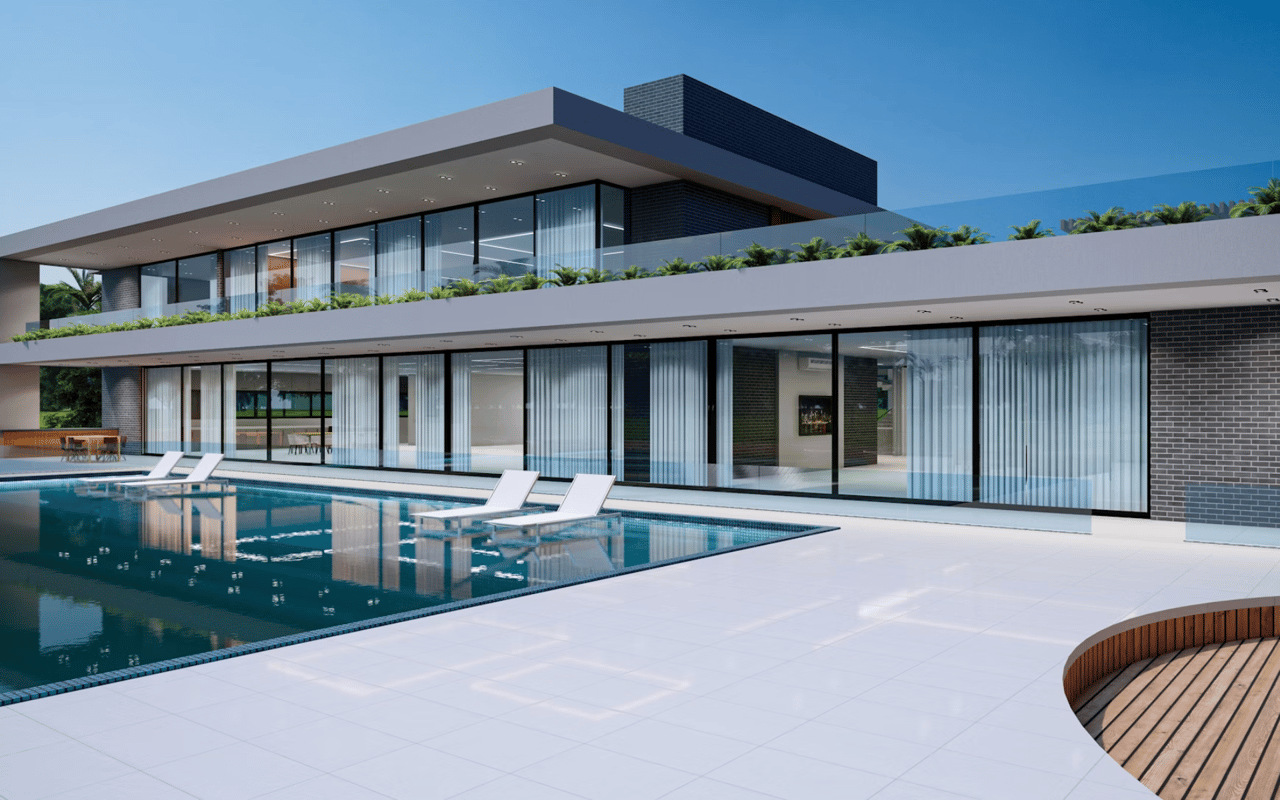
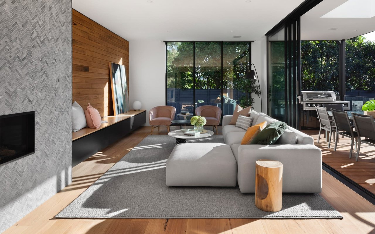
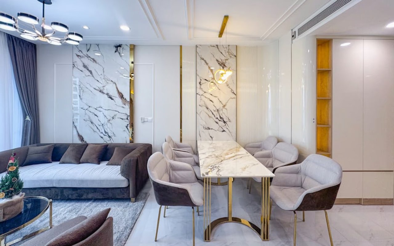
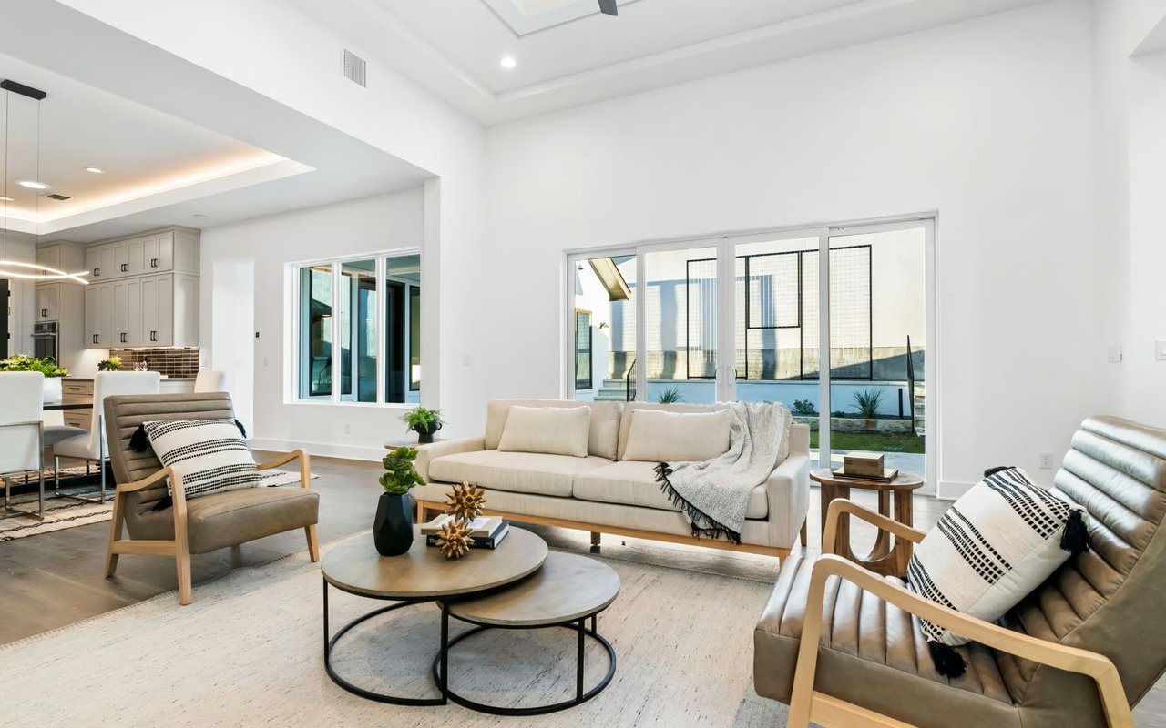
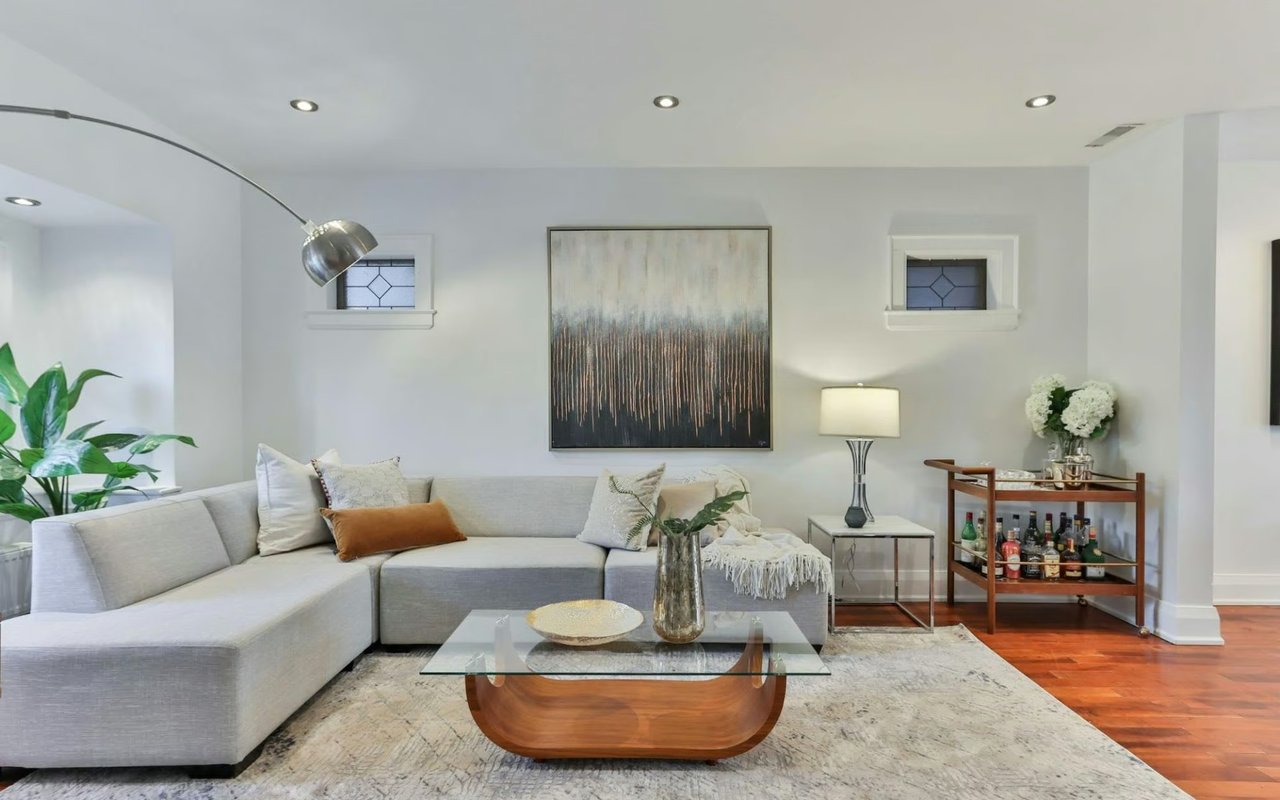
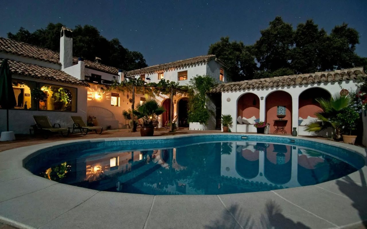
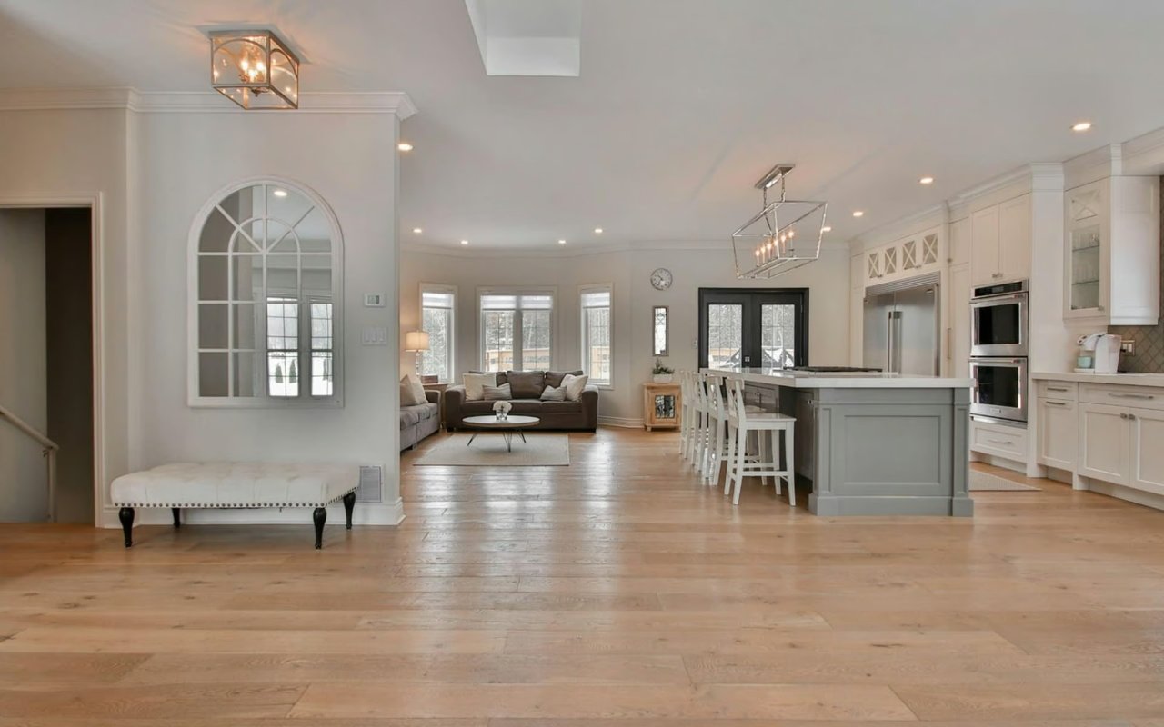
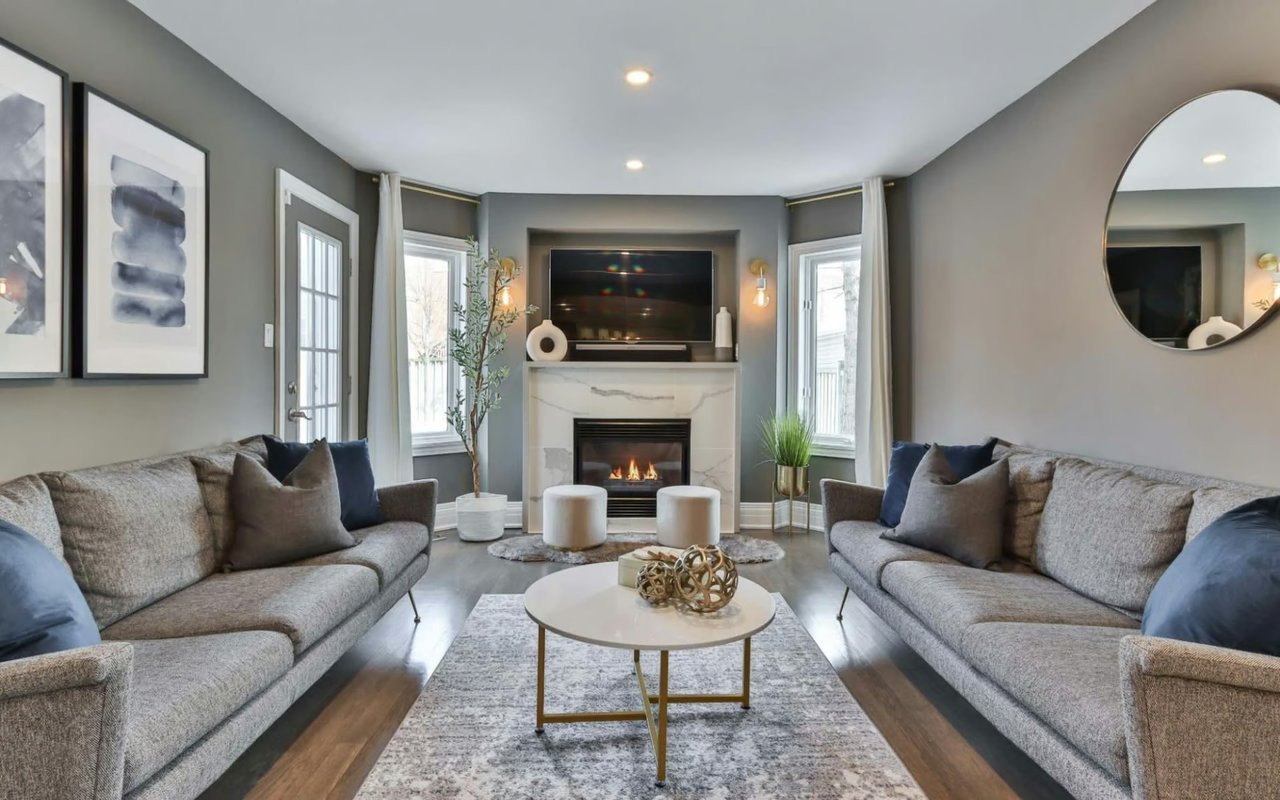
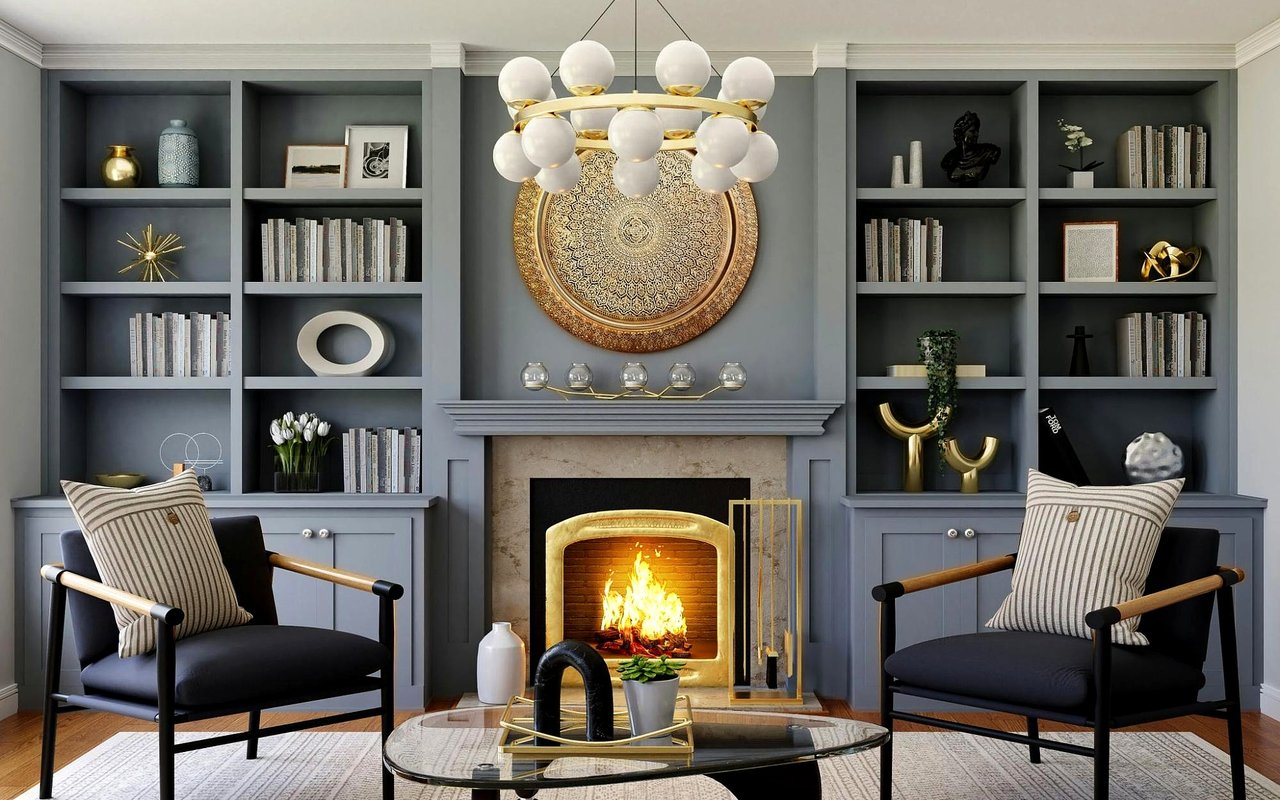
The Living Room: Set the Tone for Your Entire Home
Your living room is the first space guests experience and the one your household returns to most. It needs to feel welcoming to visitors, comfortable for daily use, and versatile enough to shift from a relaxed weekday evening to a livelier weekend gathering. That's a lot to ask of a color palette, which is why so many designers default to warm neutrals here.
In San Antonio's sun-drenched homes, these tones behave especially well as they absorb natural light during the day and shift to a golden warmth in the evening, making the room feel alive at every hour.
In San Antonio's sun-drenched homes, these tones behave especially well as they absorb natural light during the day and shift to a golden warmth in the evening, making the room feel alive at every hour.
Getting the Most Out of Your Living Room Palette
-
If you want visual interest without committing to bold color, use warm neutrals on the walls and introduce depth through a darker-toned sofa, wood accents, or woven textiles
-
A single deep accent wall creates a focal point and adds personality without requiring the entire room to carry that weight
-
Cool gray walls can read as flat and unwelcoming under artificial light; if you love gray, look for versions with warm or greige undertones
-
Test any paint sample in both daylight and lamplight before committing, as living rooms see both, and some colors shift dramatically between them
The Bedroom: Design for Rest and Restoration
The bedroom is where color psychology in home design does some of its most important work. Sleep quality, stress recovery, and how quickly you wind down at the end of the day are all influenced by your visual environment, and most people are sleeping in rooms that aren't optimized for any of that. Bold, stimulating colors keep the nervous system alert. Soft, cool tones do the opposite.
The goal isn't a boring room. It's a room that lets you actually decompress, which is a very different thing.
The goal isn't a boring room. It's a room that lets you actually decompress, which is a very different thing.
Colors and Strategies That Support Better Rest
-
Soft blue remains one of the most research-supported bedroom colors for lowering heart rate and signaling the brain toward sleep
-
If you want warmth without stimulation, try creamy ivory or warm linen tones rather than stark white, which can feel clinical under certain lighting
-
Avoid anything in the red or bright orange family, even as an accent, as these tones raise energy levels and are counterproductive in a sleep environment
-
Matte finishes absorb light rather than reflecting it, which contributes to a softer, more restful atmosphere than satin or gloss in this room
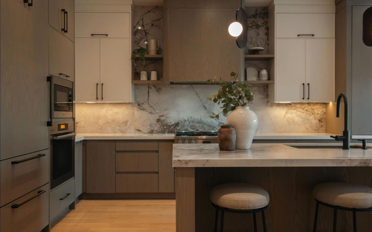
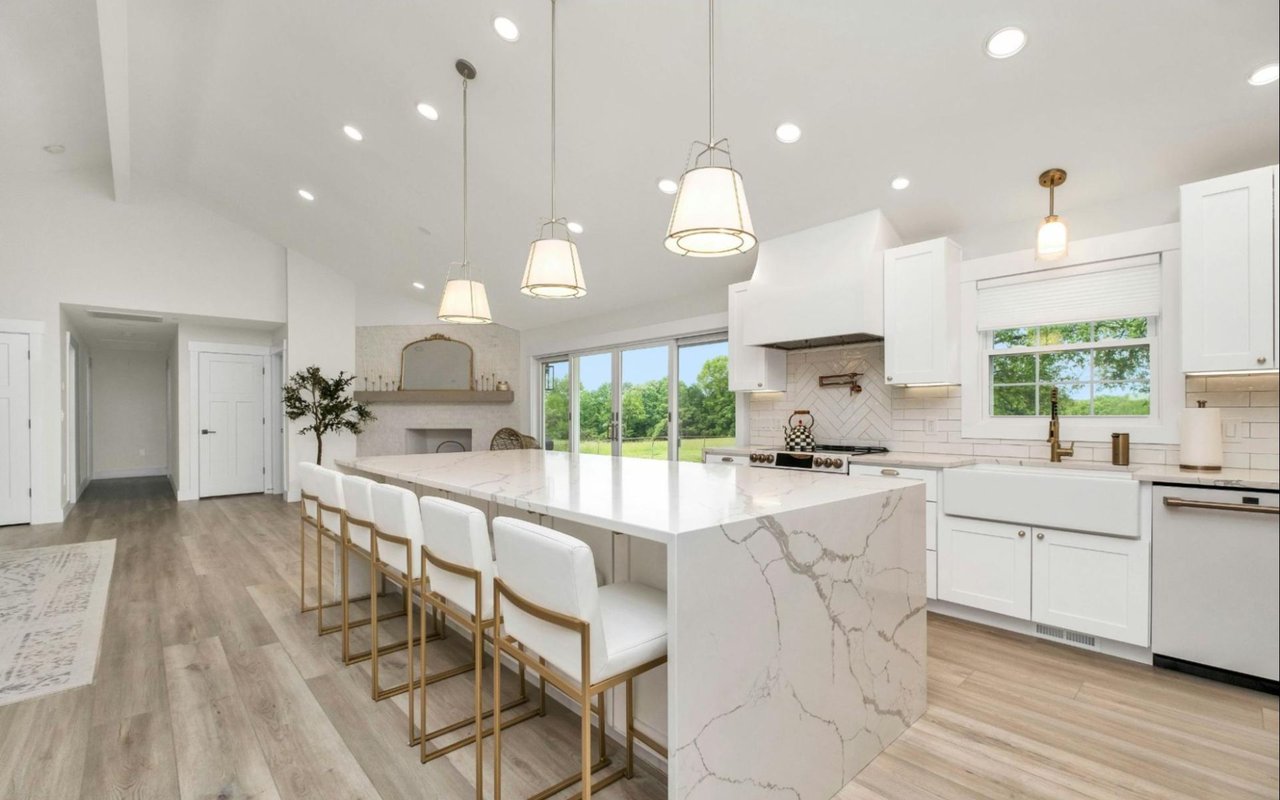
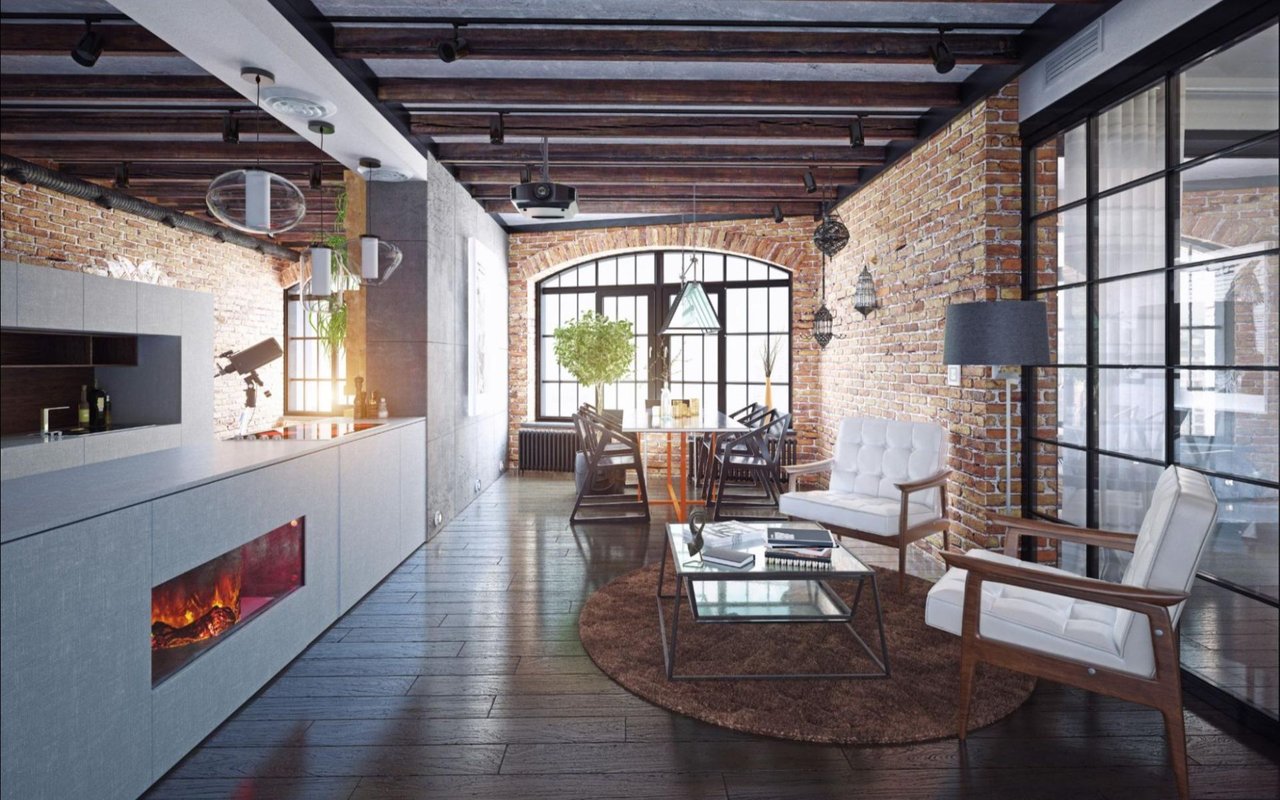
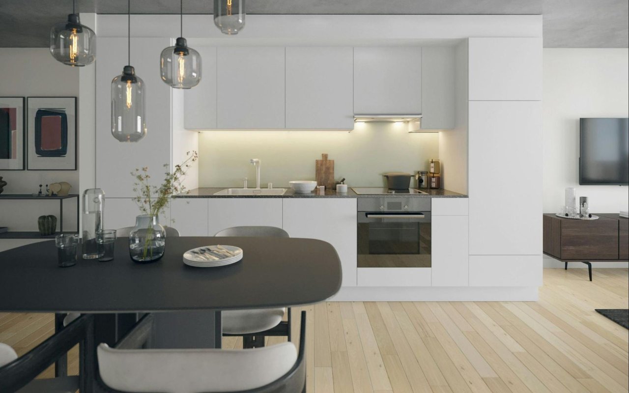
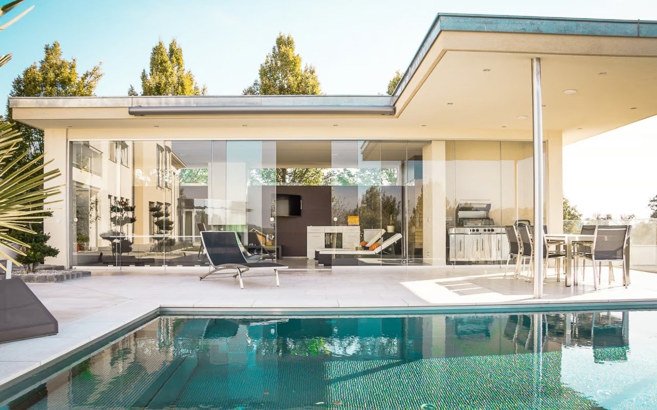
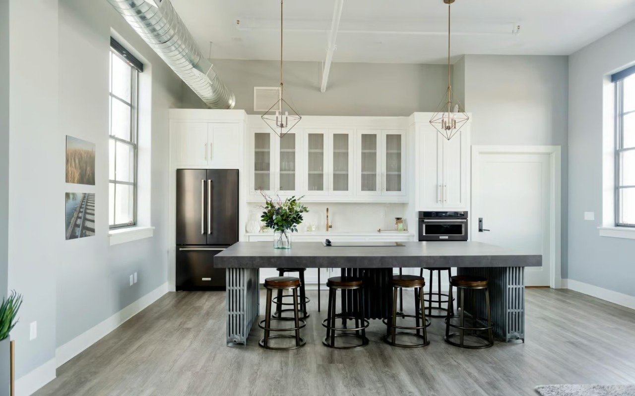
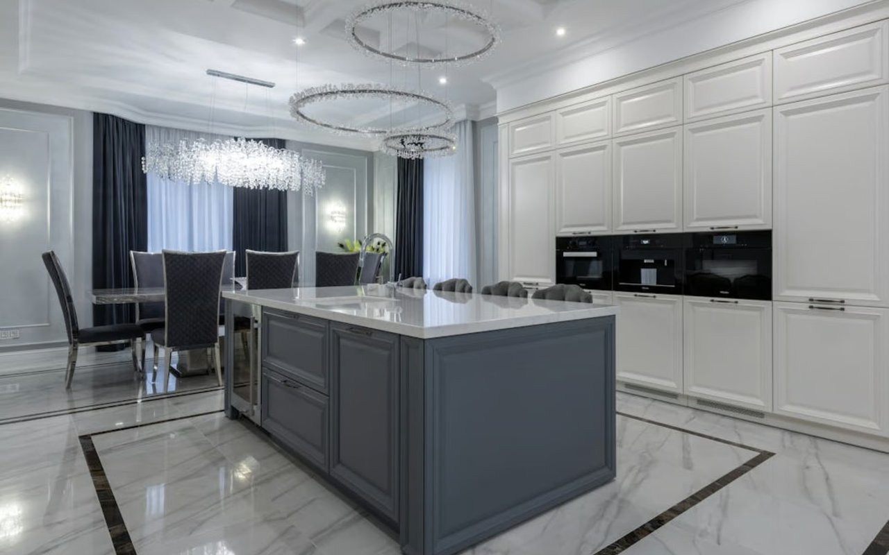
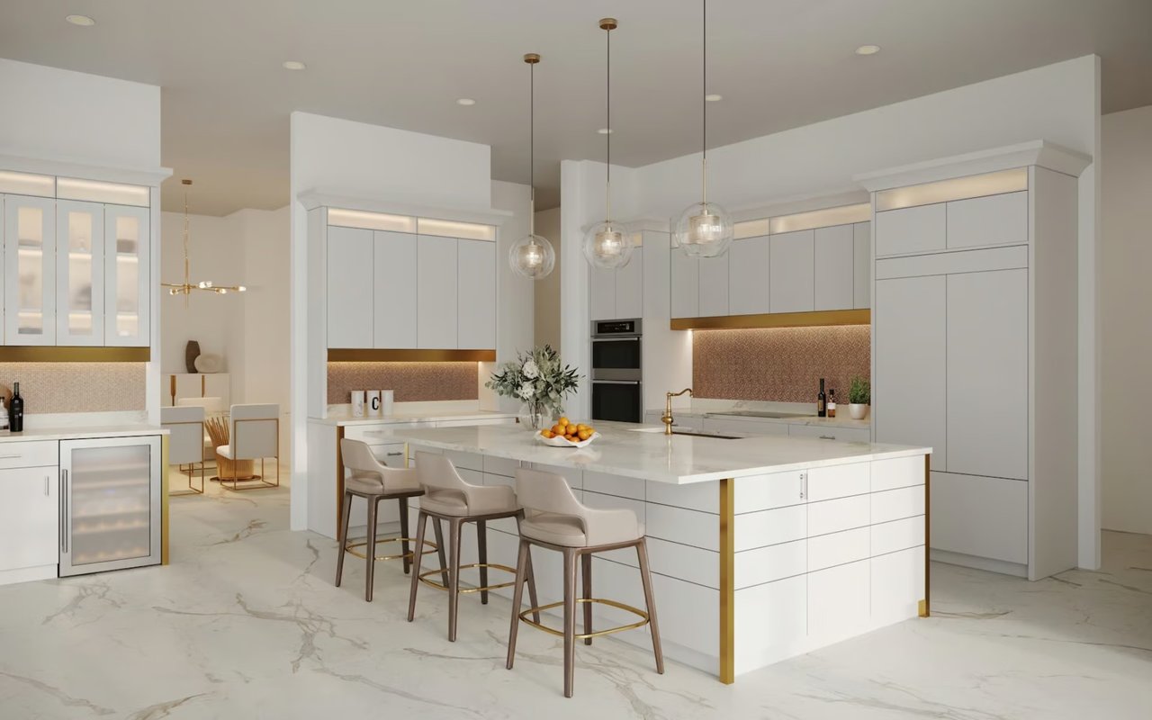
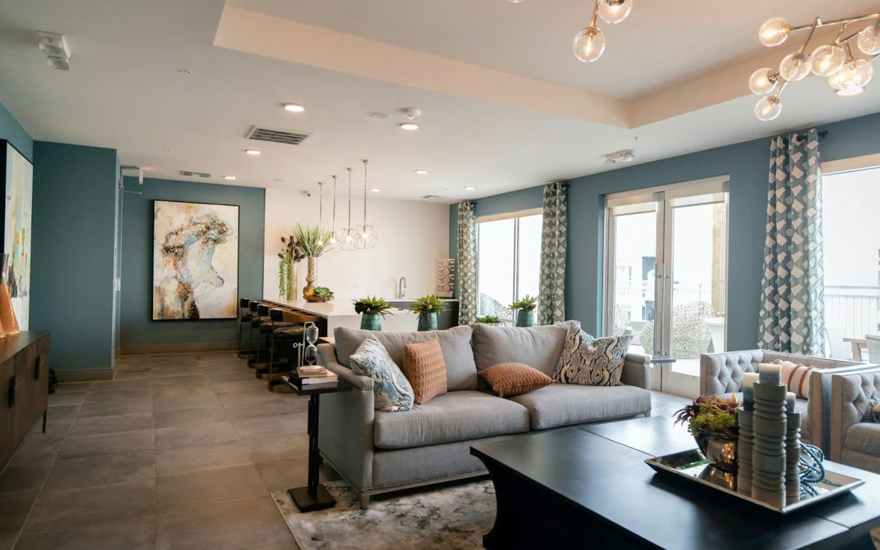
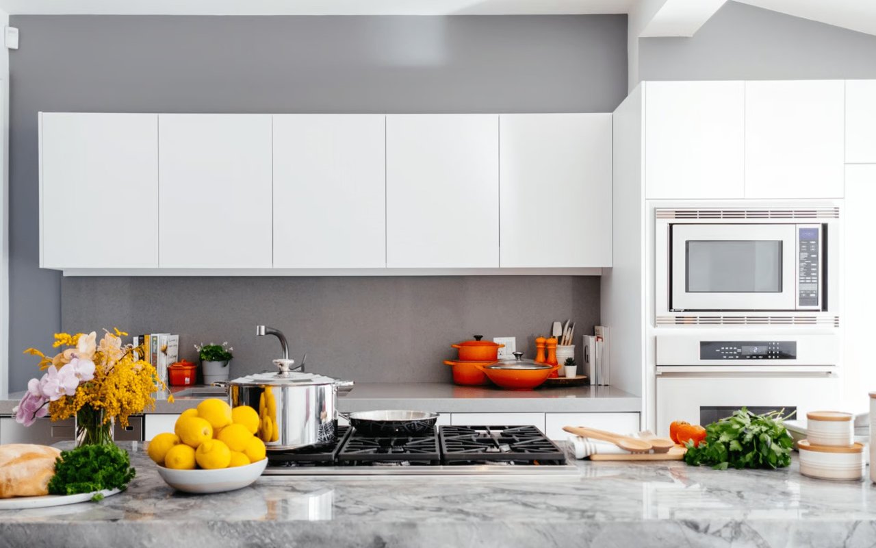
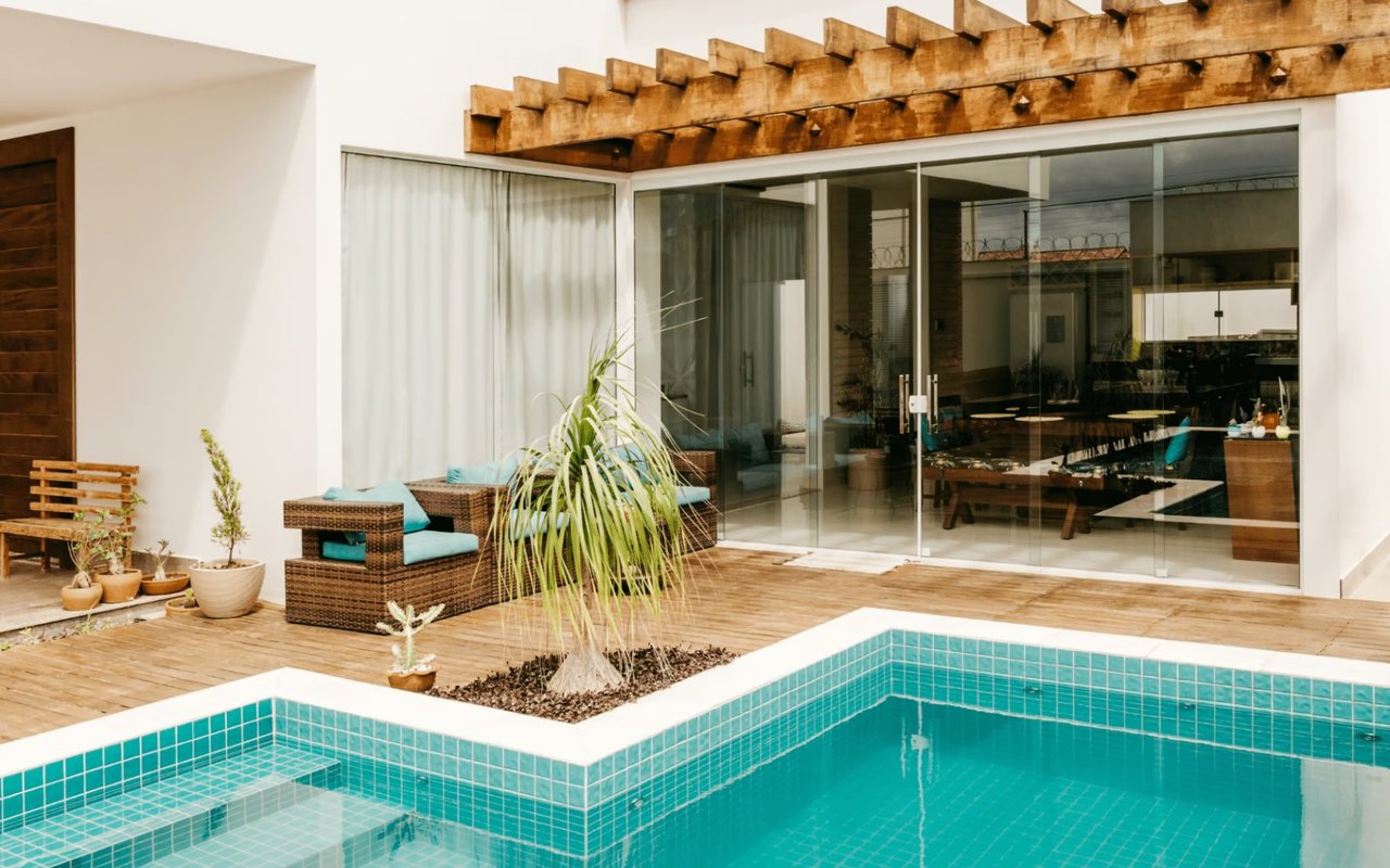
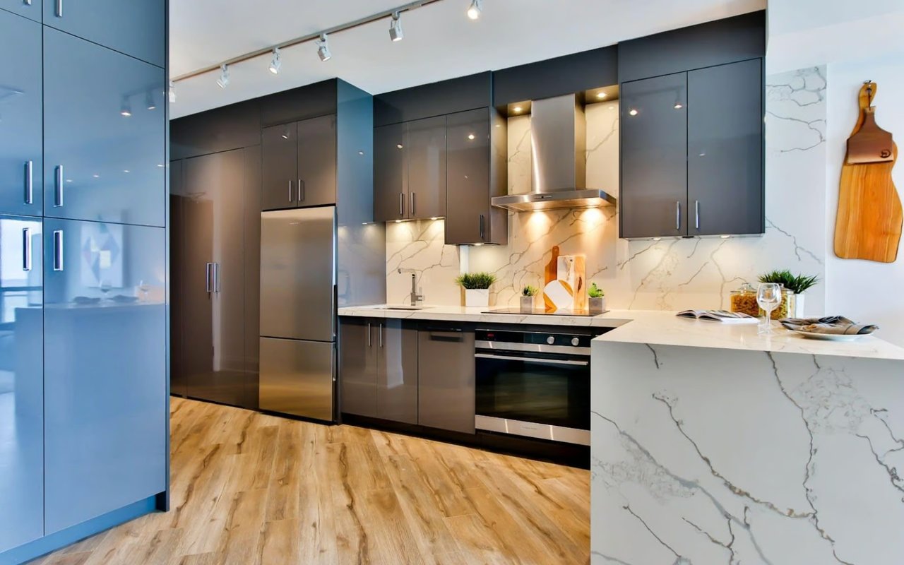
The Kitchen and Dining Room: Encourage Energy and Appetite
Kitchens and dining rooms are built for activity, such as cooking, eating, conversation, and the daily choreography of family life. Color psychology supports all of that through warm, energizing tones that stimulate appetite and encourage people to linger at the table. The nuance here is in application: the same warm red that feels inviting on an accent wall can feel aggressive when it surrounds you on all four sides.
For open-concept layouts, which are common across San Antonio's newer construction, the kitchen palette also needs to work in relationship with the adjacent living space, not just on its own.
For open-concept layouts, which are common across San Antonio's newer construction, the kitchen palette also needs to work in relationship with the adjacent living space, not just on its own.
Color Decisions That Serve Kitchens and Dining Spaces Well
-
Warm white or cream on the walls gives the kitchen a clean, open feel while adding enough warmth to keep the space from feeling sterile
-
Deep green on cabinetry is having a strong moment and adds richness without requiring a bold wall color commitment
-
Reserve terracotta, warm clay, or golden yellow for accent walls, island focal points, or decorative tiles rather than applying them to every surface
-
In open-concept homes, choose a kitchen tone that sits in the same temperature family as your living area palette so the two spaces read as connected rather than competing
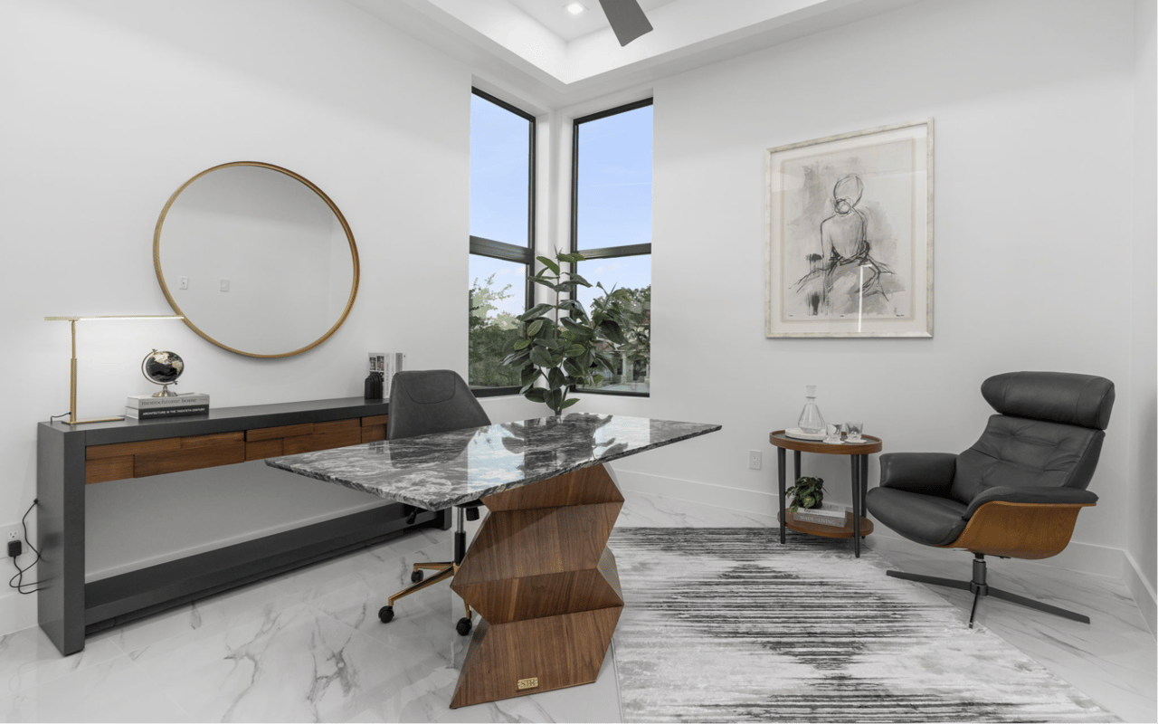
The Home Office: Balance Focus With Comfort
A home office needs to do two things at the same time: support concentration during working hours and not make you dread walking into it. Highly saturated or stimulating colors create visual noise that competes with focused thinking. Colors that are too cold or institutional can drain motivation over time. The sweet spot sits in the middle, with soft, grounded tones that feel purposeful without being clinical.
Your personality matters here too. Someone who thrives on structure will respond differently to a color than someone who does their best thinking in a warmer, more casual environment.
Your personality matters here too. Someone who thrives on structure will respond differently to a color than someone who does their best thinking in a warmer, more casual environment.
Office Color Choices That Work Across Personality Types
-
Soft blue-gray is a strong all-around choice; it reads as calm and professional without the coldness of a pure gray or bright blue
-
If you find cool tones draining, warm putty, greige, or soft terracotta keep the space grounded while still feeling intentional and work-ready
-
Deep navy or charcoal on a single wall behind a desk creates visual definition for video calls and adds a polished quality to the space
-
Avoid painting a home office in the same palette as your bedroom; you want a clear psychological distinction between rest space and work space
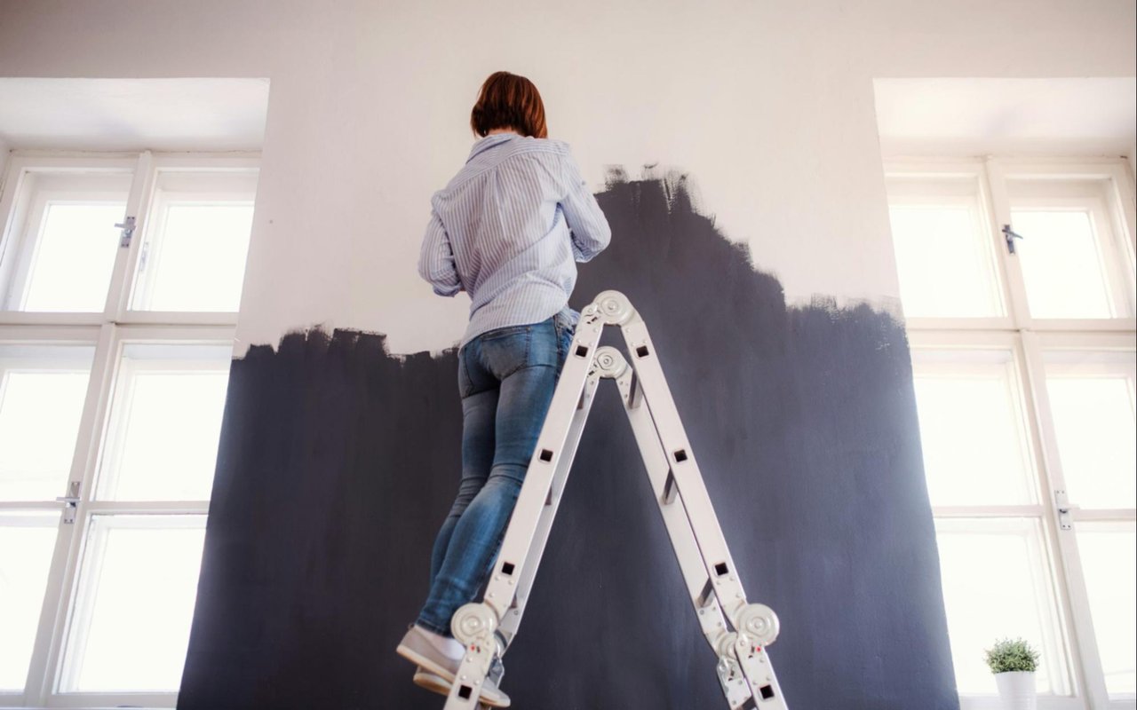
How to Apply Color Psychology Without Repainting Everything
One of the most practical things about color psychology in home design is that major impact doesn't require major commitment. Before picking up a brush, consider whether a targeted change — a single wall, updated cabinetry, or a shift in soft furnishings — might give you what a full repaint would, at a fraction of the cost and disruption.
Starting small also lets you live with a color direction before fully committing to it.
Starting small also lets you live with a color direction before fully committing to it.
Ways to Test Color Psychology Without Full Repainting
-
Paint one accent wall and live with it through different times of day and seasons of light before deciding whether to extend the color further
-
Swap out rugs, throw pillows, and curtains in a new color family
-
Update cabinet or door color in kitchens and bathrooms for a high-visibility change that doesn't require touching the walls at all
-
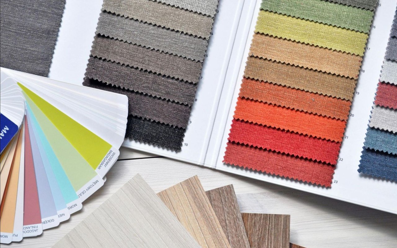
Use larger paint swatches rather than small chips, and evaluate them on the actual wall rather than holding them up in the store
FAQs
How does San Antonio's natural light affect paint color choices?
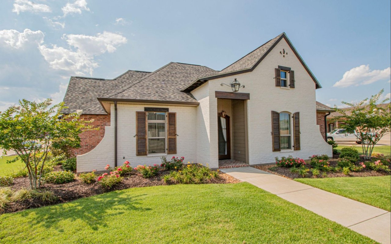
Our climate means most homes get a significant amount of warm, direct sunlight for much of the year. That light intensifies warm tones and can wash out very light or cool colors, making them look faded rather than crisp. When choosing paint in San Antonio, lean into colors with warm undertones and always test swatches in the actual room at different times of day. Morning and afternoon light here can make the same color look like two different shades.
Can color psychology in home design help when we sell our home?
Yes, and it's something we think about with sellers regularly. Warm, neutral tones in main living areas appeal to the broadest range of buyers and photograph well in listing photos. Highly personal or very bold color choices can pull a buyer's attention away from the home's best features. Strategic, psychology-informed color choices help a home feel move-in ready and emotionally inviting, both of which influence how buyers respond and what they're willing to offer.
How do we decide between a trending color and a timeless one?
A good rule of thumb: use trending colors where commitment is low and updates are easy, such as accent walls, pillows, artwork, and décor. For bigger investments like full room paint, cabinetry, or tile, lean toward tones with proven staying power. Warm neutrals, muted greens, and soft blues have demonstrated real longevity in interior design and won't read as dated in a few years the way highly specific trend colors often do.
Contact The Herrera Team Today
Whether you're preparing your San Antonio home for the market or simply want it to feel better to live in every day, the right color choices can make a real difference. We at The Herrera Team love helping homeowners see their spaces with fresh eyes, and we're always happy to share what we know works in this market.
Ready to take the next step? Contact The Herrera Team, and let's talk about what your home can become.
Ready to take the next step? Contact The Herrera Team, and let's talk about what your home can become.